It’s important that every page of your website is optimized, and while some pages may come first, your end goal is to make sure that every page looks is helping give you the best results possible. Many businesses sometimes ignore the pages that come after a conversion, like a thank you page, or are because of an error, like a 404 page, or pages that are negative, like an unsubscribe page. The truth is, however, that every page can offer an opportunity to help improve and even grow your business if you optimize it correctly. The sooner you can get started focusing on some of these pages the better, and the unsubscribe page you show to your readers is a great first step.
Tips for Optimizing Your Unsubscribe Process
Your first mandatory step is to make sure your button is easy to find. This isn’t an optimization tactic so much as a customer experience tip. You always want to make sure that those who want to unsubscribe are not annoyed with finding your button. Even worse, if they can’t find your button quick enough and give up they will only be that much more frustrated with your company every time a message comes through.
Once you do this, you can start to move on to a few more optional things that will help really optimize the page and give you the most opportunity for improvement:
Ask Why They’re Leaving
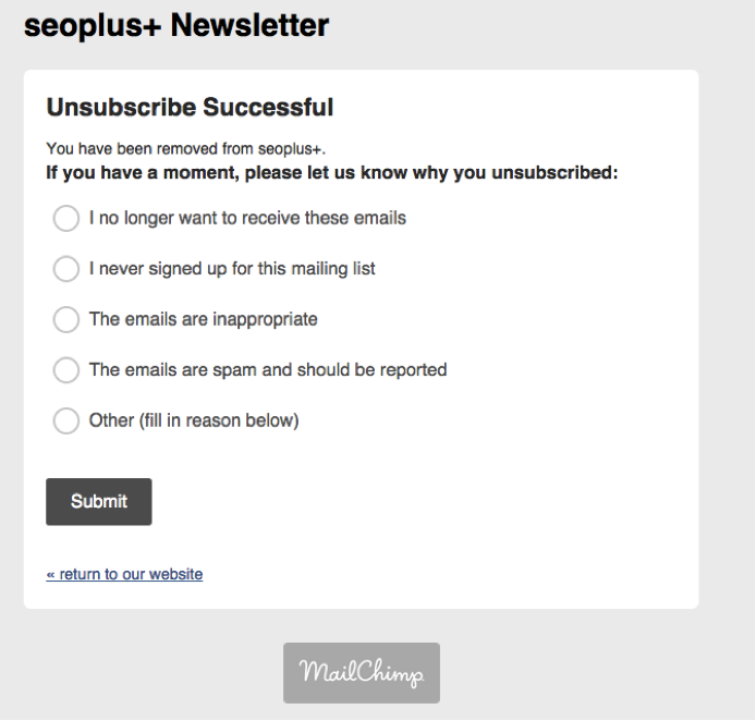
This is one of the best and most popular ways to actually learn something from your unsubscribers. By using a tool like MailChimp, you can add a very small set of questions asking why someone left. It only takes a minute to answer, so people are willing to click and let you know why they’re leaving. You can then use this data to improve your newsletter in the future. Below is an example from SEOPlus+ that uses MailChimp, and while the page could be a little bit flashier or more interesting, the response reasons they gave are great:
Offer Different Options before Leaving
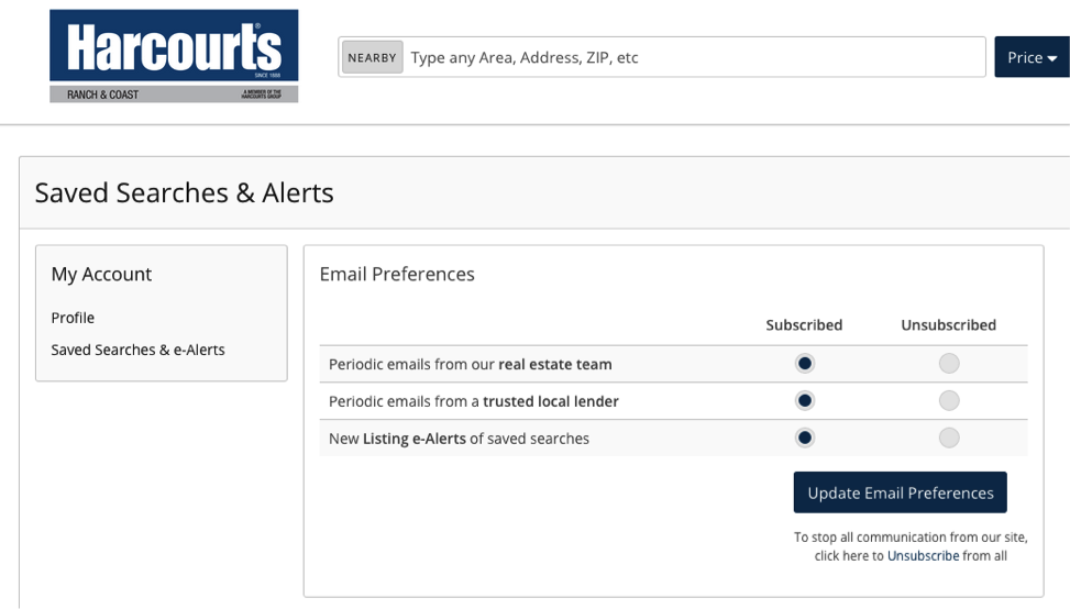
This is one great way to not lose a customer or reader entirely. If for some reason you have multiple email threads and chains going and this person is subscribed to them all, remind them of them and allow them to just unsubscribe from one. For example, the screenshot below is from an unsubscribe page from a relator. Instead of just having one unsubscribe option, they let you know that you can customize what messages you want to receive; thus making it more appealing to stay:
Highlight Your Social Links
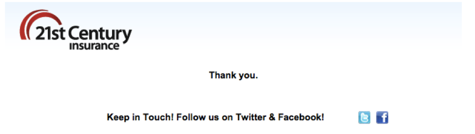
When all else fails, push your social media channels. It’s easy to follow and they’re easy to include on webpages, so when someone unsubscribes remind them that they can follow you on social media. For some people email is the problem more so than anything else, so hearing from you through different platforms may be best. Below is an example from 21st Century Insurance. Again this isn’t the flashiest or best design, but it gets the job done:
Highlight Popular Links
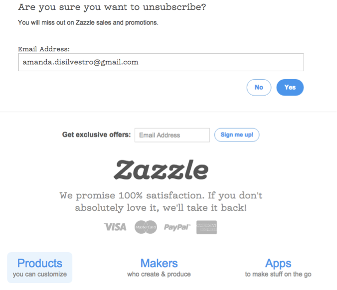
Going along with including your social media links, some companies choose to show you some of their most popular categories and include a CTA right there on the unsubscribe page! If done incorrectly this could backfire, but if you make it easy to unsubscribe while still tempting readers to click a link to learn more you could keep a few subscribers around. Below is an example from Zazzle shows how to put a CTA and important links on the page before you unsubscribe:
Include an Incentive
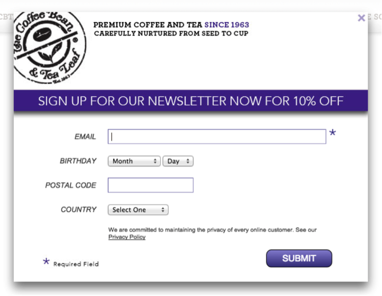
This is not a very popular option for small businesses, but it’s worth mentioning nonetheless. This page usually comes after someone has unsubscribed and is actually a way to get them to re-subscribe to something else your company is doing. Below is an example from The Coffee Bean that offers a promotion for signing up:
Give Them a Chance to Re-Subscribe
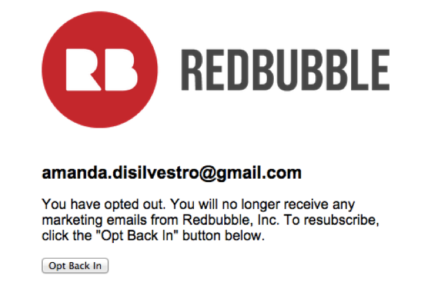
If flashy surveys and pages are not your thing and you want to keep it as simple as possible, you may just want to give them an option to change their mind right then and there. This isn’t usually as effective as the tactics above because it doesn’t do anything to change the reader’s mind from the time of unsubscribing, but it’s still better than nothing. Redbubble does just that after I asked to unsubscribe:
Your last mandatory step is to make sure you don’t send any emails after someone has chosen to unsubscribe. If you want to send one confirmation email to let them know the unsubscribe was successful that will usually be OK, but anything beyond that is a definite “don’t bother.” Again, this will only annoy your readers and will start to give you a bad reputation. If you want someone to re-subscribe, you’re just going to have to continue publishing great content and utilizing social media.
Do you have any tips for improving the unsubscribe process (either as a Webmaster or a general consumer)? Let us know in the comment section below.