
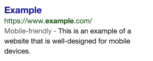
Earlier this week Google officially rolled out Mobile-Friendly labels, or small labels that will show up next to results on a mobile SERP that lets searchers know whether or not that website is optimized for the mobile screen. The idea is that if a result has the label, it will be easier to read because the text will be the right size, there won’t be any images taking up the entire screen, no scrolling back and forth to read content, etc. That website is optimized. If it doesn’t have the label, you’ve got the opposite problem.
Long story short, if you’re a Webmaster you want that new Mobile-Friendly label. Below is a screenshot from the official Google announcement that shows what the label will look like in mobile search results:
The announcement also mentioned that Google was considering using some of the mobile-friendly criteria when it comes time to get a boost in search results. You can learn more about the criteria Google looks for to give your website this label here as well as how to start getting your website to fit that criteria. Of course your next step is making sure that you’ve done everything correctly, and that’s where the new Mobile-Friendly testing tool comes into play.
How the New Mobile-Friendly Testing Tool Works
You can find the new tool here and it works on a pass/ fail system (incredibly similar to the PageSpeed Insights tool for mobile also from Google). It’s as simple as typing in your website and then reading the message that Google generates for you. Consider the following two examples:
Optimized Mobile Website
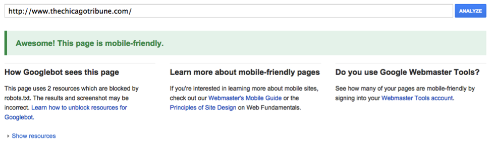
As you can see, the above example is pretty straightforward and doesn’t give a lot of advice. Each time I typed in a website that got a positive response, it was always “Awesome! This page is mobile-friendly” and listed how many resources are blocked by robots.txt and how to fix it. That is as far as I’ve seen any advice go if you get this message (and in some cases you get no advice at all!).
Non-Optimized Mobile Website
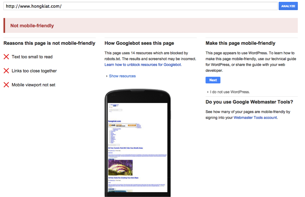
In the example above you can see that Google lists three things the website needs to work on before it might be considered optimized: The text is too small, the links are too close together, and the mobile viewpoint is not set. It shows you what the site looks like to Google and users and then offers a link to help you make the page mobile-friendly. In other words, this is an excellent tool if you’re in need of a little bit of guidance.
In the end, if you don’t pass you’re not going to get a mobile-friendly label or that potential boost in mobile rankings, so back to the drawing board. Fortunately, optimizing for mobile is pretty simple if you have a responsive design, are smart with your linking, and don’t use Flash. Visit this article to learn more details about optimizing your website for mobile and statistics on why it really matters for businesses.